Designing my own portfolio
I designed and built zoe-alessandro.com to present my photography, explain my other work and make it easy to start a project. Here are the decisions behind the site you are using.
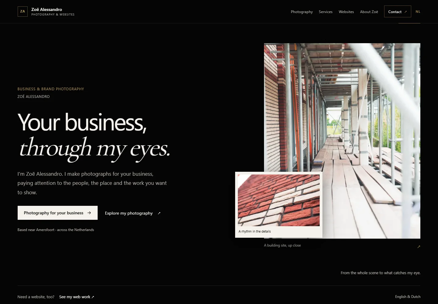
The brief
A home for my photographs.
I needed a place where someone could see my photographs, understand what I offer and contact me. I also wanted to show the website itself as a project. That meant giving each part a clear place.
- Photography leads the homepage and has its own gallery index.
- The website offer and my inspection background have separate pages.
Simplified design demonstration
From content to a page layout.
This simplified example uses my photographs to show how a page takes shape. Choose a stage to compare content order, layout, colour and different screen sizes.
-
Introduction · photographs · contact
What goes on the page?
I start with what someone needs to know. Here that means a short introduction, photographs to look through and a way to ask about a shoot.
- Introduce the photographer
- Show a selection of photographs
- Make it easy to get in touch
-
Image size · reading order · space
Where does everything go?
Before choosing colours, I decide how much room each part needs. The photographs should be large enough to see properly, and the introduction should leave room for them.
- Give the opening photograph room
- Keep text lines comfortable to read
- Put related parts beside each other
-
Type · colour · photographs
Choose the look
I chose a dark background so the colours in my photographs stand out. Warm accents mark links and small details; the same type and spacing connect the pages.
- Readable headings and body text
- A dark background with warm accents
- Enough space around each photograph
-
Desktop · tablet · mobile
Different screens
The example rearranges for smaller screens. The photographs and text keep their reading order, with more room for each element on mobile.
- Images stack on smaller screens
- Links and controls work by keyboard and touch
- The content remains readable without animation
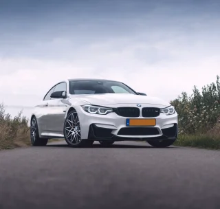

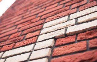
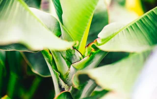
One page example, shown at four points in the design process.
Decision 01
Let the photographs do the talking.
A dark background gives the colours and light in the photographs room. The gallery captions sit below the images, and each photograph opens at a larger size. Series notes explain the subject without making you read an essay before seeing the work.
Decision 02
Give a phone its own reading order.
Side-by-side sections become a single reading sequence on smaller screens. Images load at a size suited to the screen, and navigation stays within reach. Dutch headings need their own attention: they often take more space than the English version.
Decision 03
Make the first message easy.
You only have to type a name, email address and message. Extra questions sit in an optional section and change with the kind of inquiry. Someone with a first idea can write just as easily as someone with a detailed brief.
Technical implementation
Built with Astro and TypeScript.
The result
What the portfolio does today.
The result is a working portfolio in English and Dutch, with photo galleries, interactive demonstrations and a form that adapts to the type of inquiry.
- Complete English and Dutch pages with reciprocal language links.
- Photography galleries with keyboard-accessible controls.
- A responsive website-build demonstration and a labelled workflow concept.
- A contact form for photography, website, workflow and collaboration inquiries.
Your website
Thinking about your own website?
Share what you do, who the site is for and what you already have. We can discuss a practical first step.
Discuss your website